Signs, Tools, and problem
The sign is done! It look much better as there is a more distinct difference between front and back. Also I didn't use the pale wood that is in the original minecraft. Check it out:
Also not to mention that from the first update and you may think the redstone looks weird. Well it is intended. I like to use the dash in the line to see direction from afar. I am a redstoner in minecraft, after all. I know some of you have been complaining but I see the majority not complaining. After all redstone is not in harvest moon nor is any circuitry. Redstone changing is completely optional. I only changed to match the theme only, not to make it look like harvest moon.
Moving onto tools, there maybe a little problem. It seems that the default tool orientation seems better when playing minecraft as multiplayer. Ofcourse on singleplayer it actually looks more like harvest moon, but there is a little problem. See for yourself:
Notice the pattern that for most of the tools it seems the player is holding them from the edge that they are used for, and the holding part is somehow part of the arm. So which is why the tools orientation should be changed. If you think this is wrong and shouldn't be, please say so in the comments. I think that nobody would like to play multiplayer like that. (although I like them just the way they are) So they will change hopefully in the next update.
Also, the nether should be fixed. What do you think of my other blocks? Are they really as weird as my real life friends have told me? Should the glowstone look to match something else? More pictures, for comparison:
as I going wrong with the texture pack this entire time? I don't think so, but I begin to wonder. One complaint I have to Notch (today is all complaints, isn't it) Is the Pumpkin wearing is too shady. I can hardly see a thing. I was thinking of making it entirely transparent, but I will show you a picture you will never see again:
I have never seen anything in harvest moon that can relate to wearing a food mask. What should I make the pumpkin look like anyway?
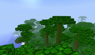
You know It seems that I still haven't touched the leaves, and vines and crops yet. I think they are perfect just the way they are, don't you? Even if I change them, they won't change the scenery to the better. Take a look:
It looks very good. I am so happy with it that I don't think it should change at the moment. Ofcourse I am not leaving it out, this is a harvest moon texture. I did change the grass and soon the flowers, but just crops already feel so nice. Ofcourse the melon will change. Maybe the wheat could change, but not in the next update. What do you think?
Last, but not least here are a few pictures of me while I was playing around, abusing the F2 button.
Still don't know which anime character this is? Well I didn't give any clues, so you're not getting any warmer. See you next time! And play more Zelda!


No comments:
Post a Comment